Access and use the Möbius Analytics dashboards
Jump to section
View the Assignments dashboard
View the Interactive Narratives dashboard
Your organization's Möbius site features a detailed activity data stream, which powers insights into student engagement and content performance.
The data collected by the activity stream for your organization's Möbius site includes events such as:
- The dates and times that students are using Möbius
- The amount of time students have spent on each page of a lesson
- The grade attained on each question of an assignment
- The number of times an interactive narrative was viewed
Through the Möbius Analytics dashboards, you can analyze how students are consuming your class content within Möbius.
To gain access to the dashboards for your organization's Möbius site, contact your organization's Möbius administrator or DigitalEd's Support Team.
TIP: The Möbius Analytics dashboards help you answer questions with actionable takeaways such as
- Are your students taking the time to engage with your content and find value?
- Are your students spending the expected time on all parts of your course content?
- Is your content the right level of difficulty for your students?
- Does your content need revising as some questions involve more work than others?
NOTE: Use the filter options at the top of the dashboards to restrict the data you're analyzing:
- Use the Select class(es) drop-down to select only actions for your chosen class(es).
- Use the Select user role(s) drop-down to select only actions by students (all types of users are included in the data).
- Use the Calendar drop-down to select a date range, and the dashboard will only include actions within that time period.

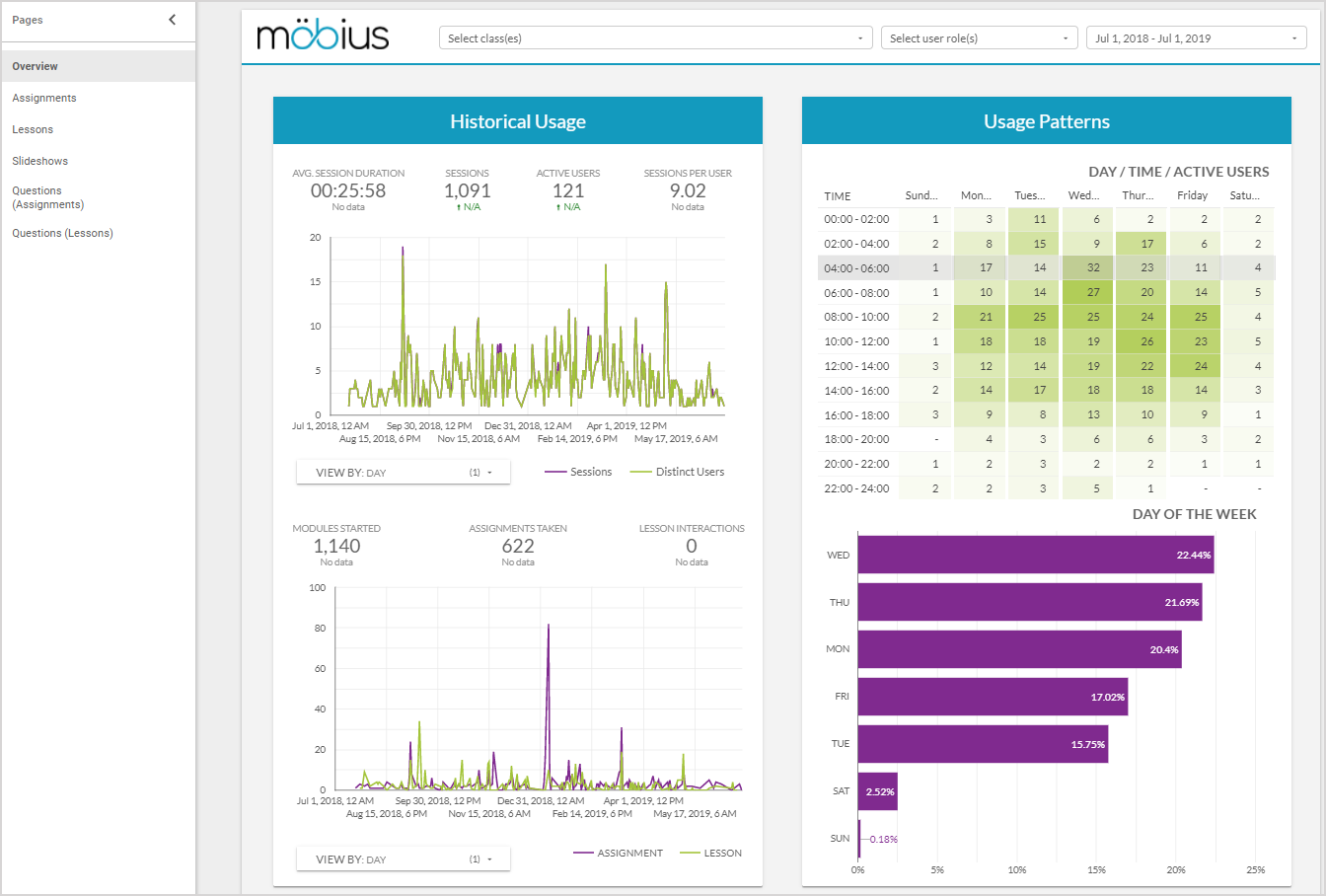
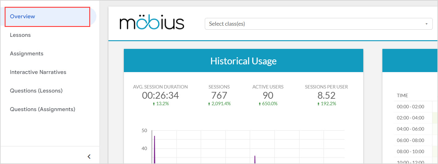
View the Overview dashboard
After accessing the Möbius Analytics dashboards, click Overview in the sidebar to view the first dashboard:
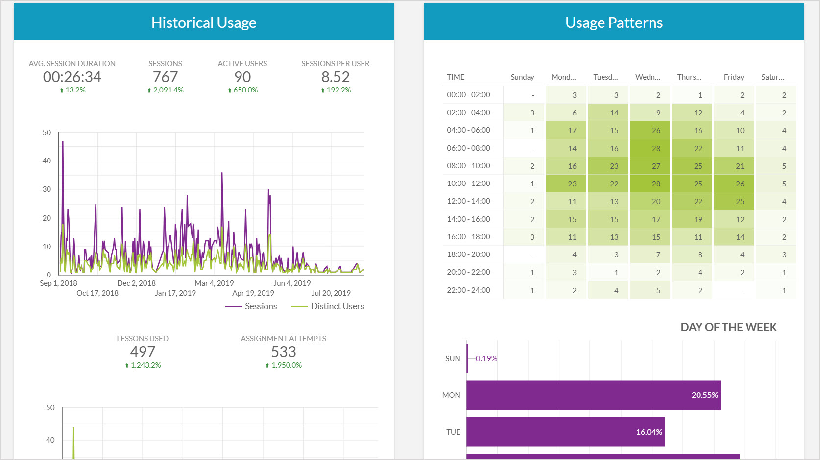
The Historical Usage panel provides daily graphs of user session duration, and the number of lesson and assignment attempts started.
The Usage Patterns panel shows the number of events on each day of the week, as well as the times of those events.
The Types of Usage panel shows the percentage of time spent by users on different types of activities, or on different types of content within activities.
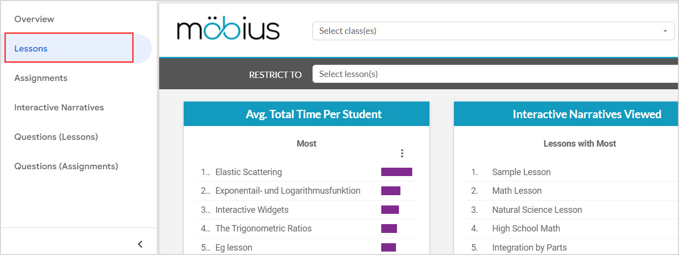
View the Lessons dashboard
After accessing the Möbius Analytics dashboards, click Lessons in the sidebar to view the second dashboard:
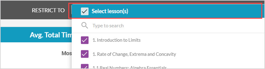
You can use the Restrict to Select lesson(s) drop-down to select specific lessons just for the data on this dashboard:
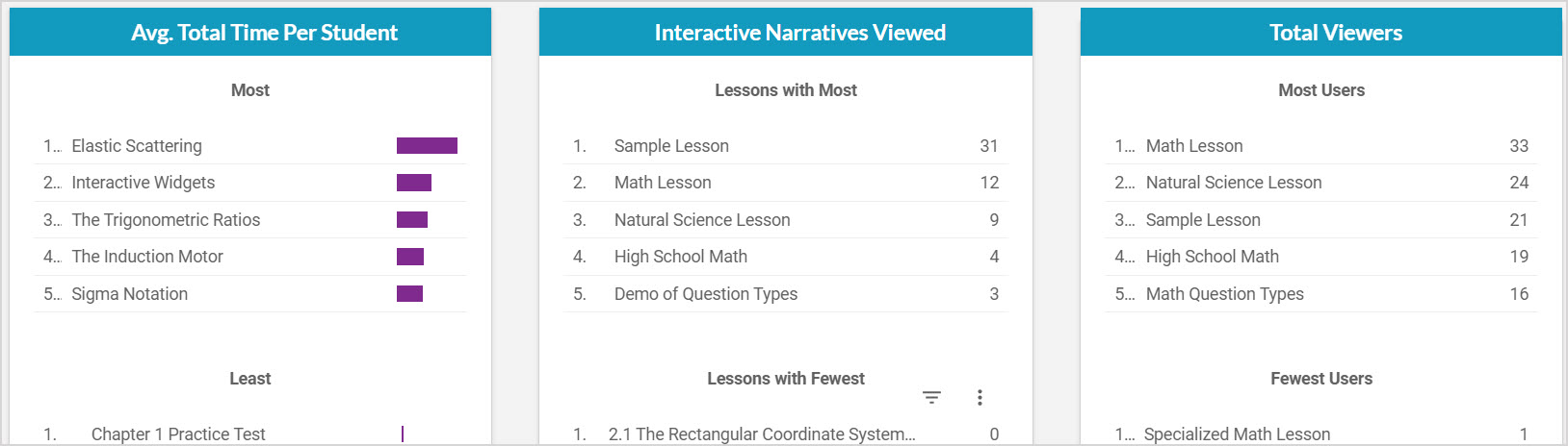
The Avg. Total Time Per Student panel shows the lessons that users, on average, spent the most and least time on.
The Interactive Narratives Viewed panel shows the lessons where users viewed the most and least number of interactive narratives.
The Total Viewers panel shows the lessons with the most and least number of distinct users who opened the lesson.
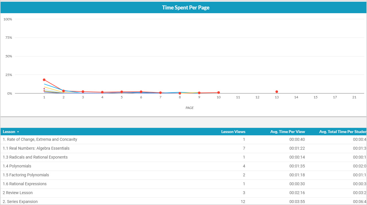
The Time Spent Per Page graph shows each lesson with the percentage of time users took viewing different pages, which provides an overview of where users are spending their time in the lesson.
The summary table gives an overall picture of the viewing habits of users on a lesson-by-lesson basis. It shows how many views each lesson has received, the average time spent per view of the lesson, and the total time a user spent on the lesson on average.
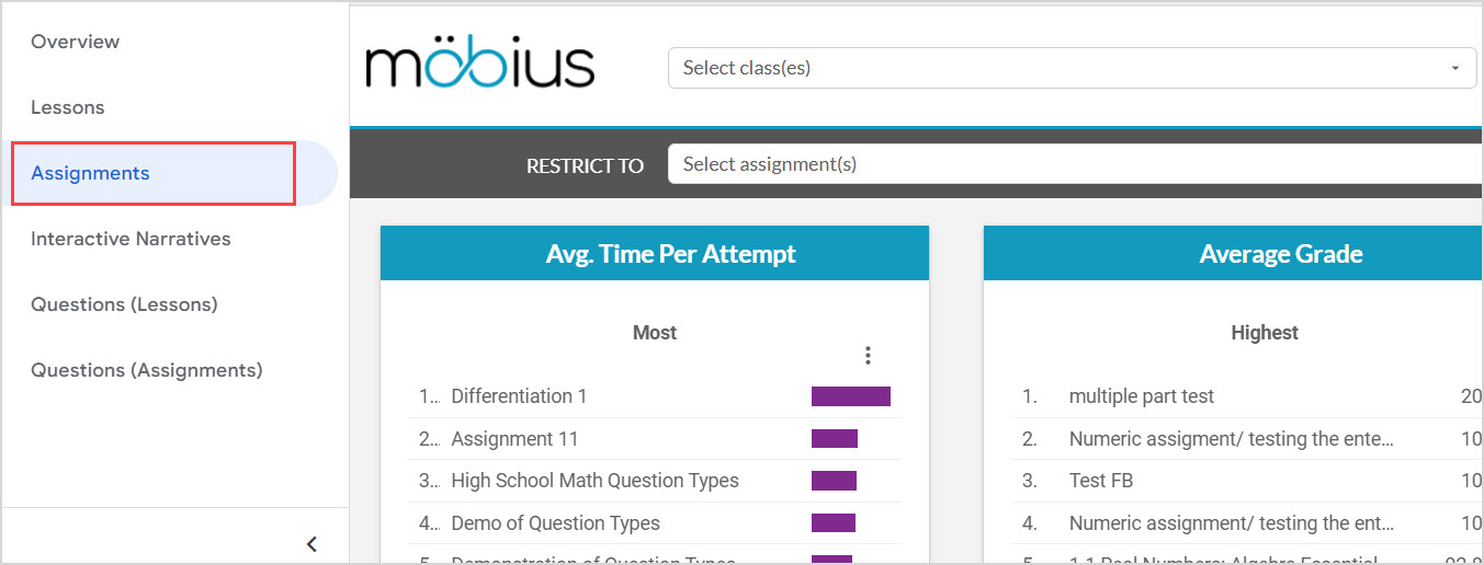
View the Assignments dashboard
After accessing the Möbius Analytics dashboards, click Assignments in the sidebar to view the third dashboard:
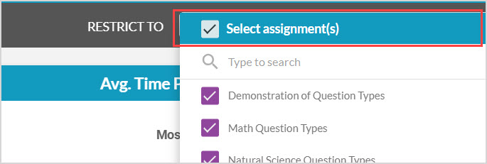
You can use the Restrict to Select assignment(s) drop-down to select specific assignments just for the data on this dashboard:
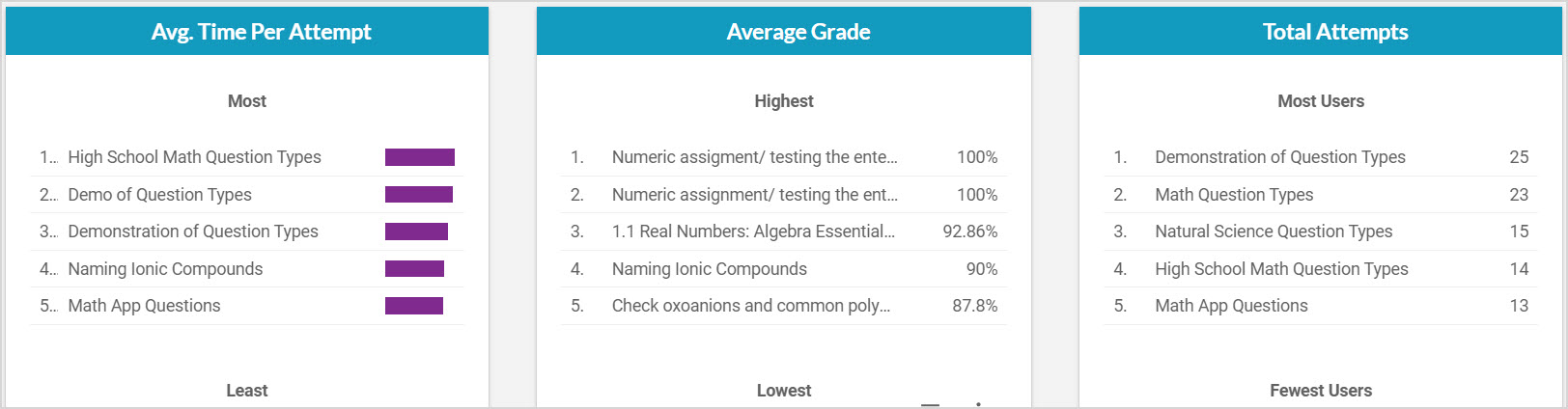
The Avg. Time Per Attempt panel shows the assignments that users, on average, spent the most and least time attempting.
The Average Grade panel shows the assignments users, on average, scored the highest and lowest grades on.
The Total Attempts panel shows the assignments with the most and least number of distinct users who opened the assignment.
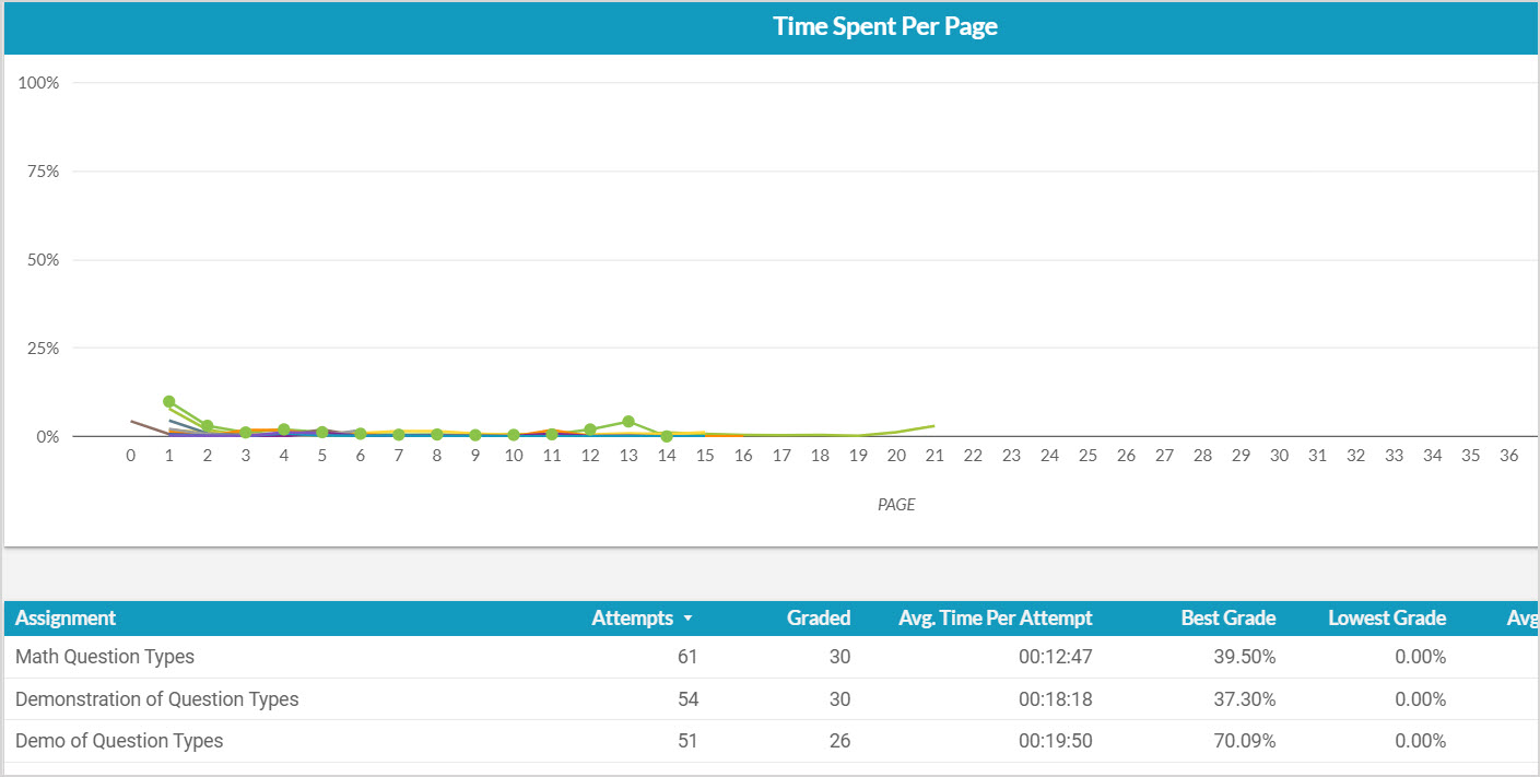
The Time Spent Per Page graph shows each assignment with the percentage of time users took viewing different questions, which provides an overview of how users are spending their time taking the assignment.
The summary table gives an overall picture of user performance on an assignment-by-assignment basis. It shows how many assignment attempts have been started, how many have been submitted and graded, the average time taken per attempt, and grade summary data in percentages.
View the Interactive Narratives dashboard
After accessing the Möbius Analytics dashboards, click Interactive Narratives in the sidebar to view the fourth dashboard:
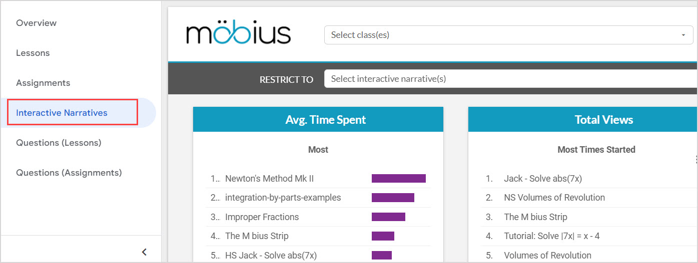
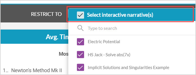
You can use the Restrict to Select interactive narrative(s) drop-down to select specific interactive narratives just for the data on this dashboard:
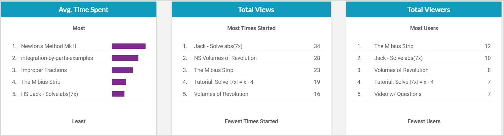
The Avg. Time Spent panel shows the interactive narratives that users, on average, spent the most and least time attempting.
The Average Grade panel shows the interactive narratives with the most and least number of total views.
The Total Attempts panel shows the interactive narratives with the most and least number of distinct users who opened the interactive narrative.
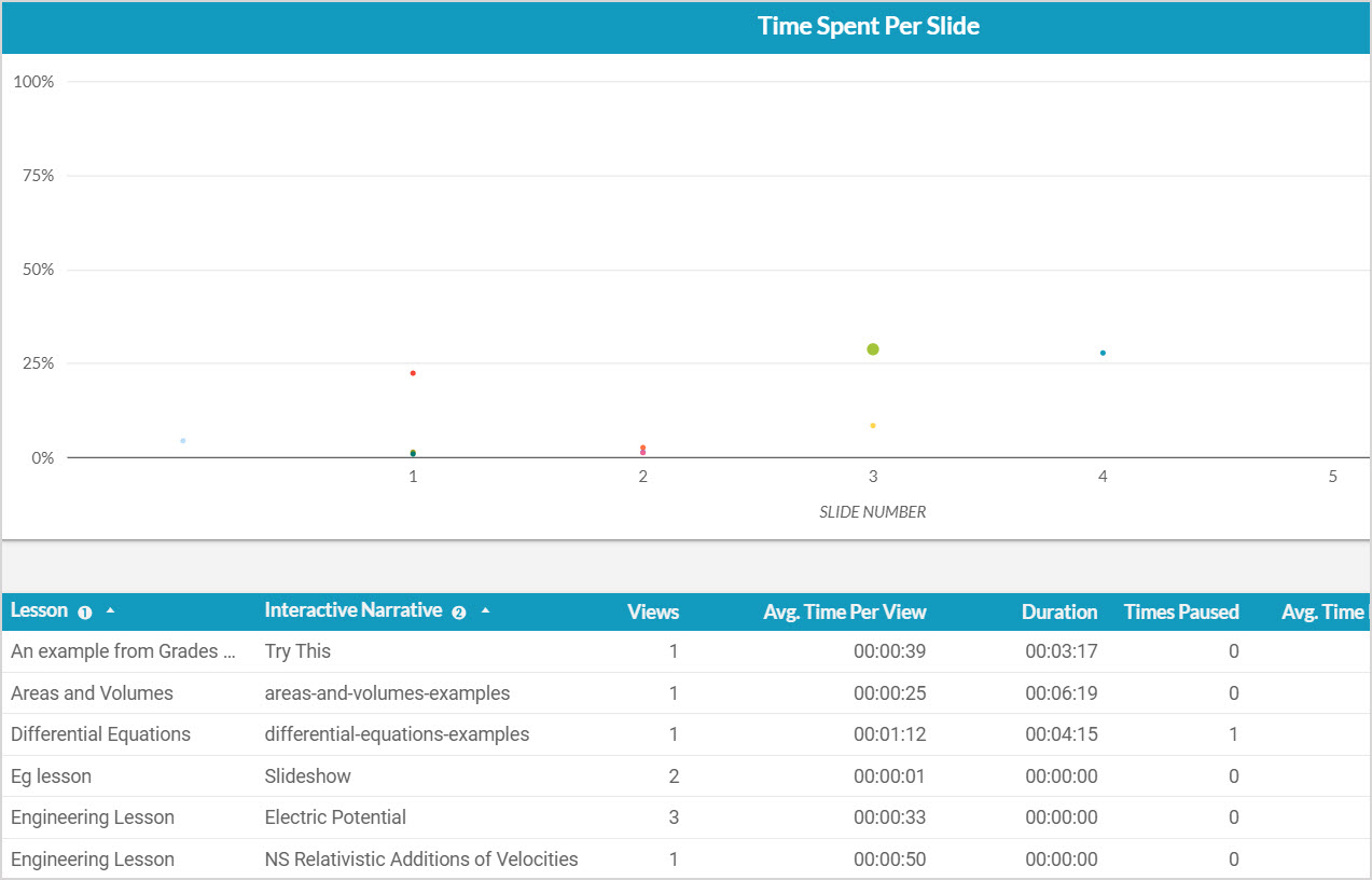
The Time Spent Per Slide graph shows each interactive narrative with the percentage of time users took viewing different slides, which provides an overview of where users are spending their time in the interactive narrative.
The summary table gives an overall picture of user's viewing habits for each interactive narrative. It shows how many views each interactive narrative has received, the average time spent per view, how often the interactive narrative was paused by users, and the number of attempts at questions inside the interactive narrative.
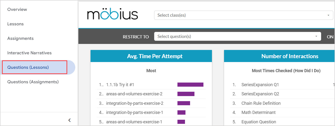
View the Questions (Lessons) dashboard
After accessing the Möbius Analytics dashboards, click Questions (Lessons) in the sidebar to view the fifth dashboard:
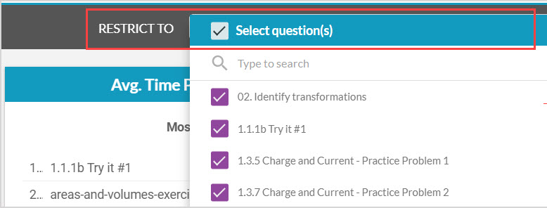
You can use the Restrict to Select question(s) drop-down to select specific questions and lessons just for the data on this dashboard:
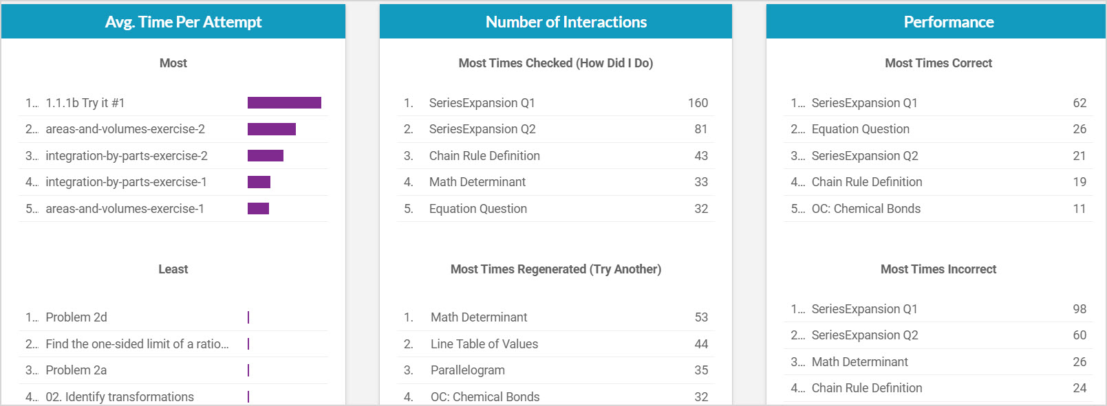
The Avg. Time Per Attempt panel shows the questions that users, on average, spent the most and least time attempting as part of lessons.
The Number of Interactions panel shows the questions that were interacted with the most as part of lessons.
The Performance panel shows the questions with the most correct attempts and most incorrect attempts as part of lessons.
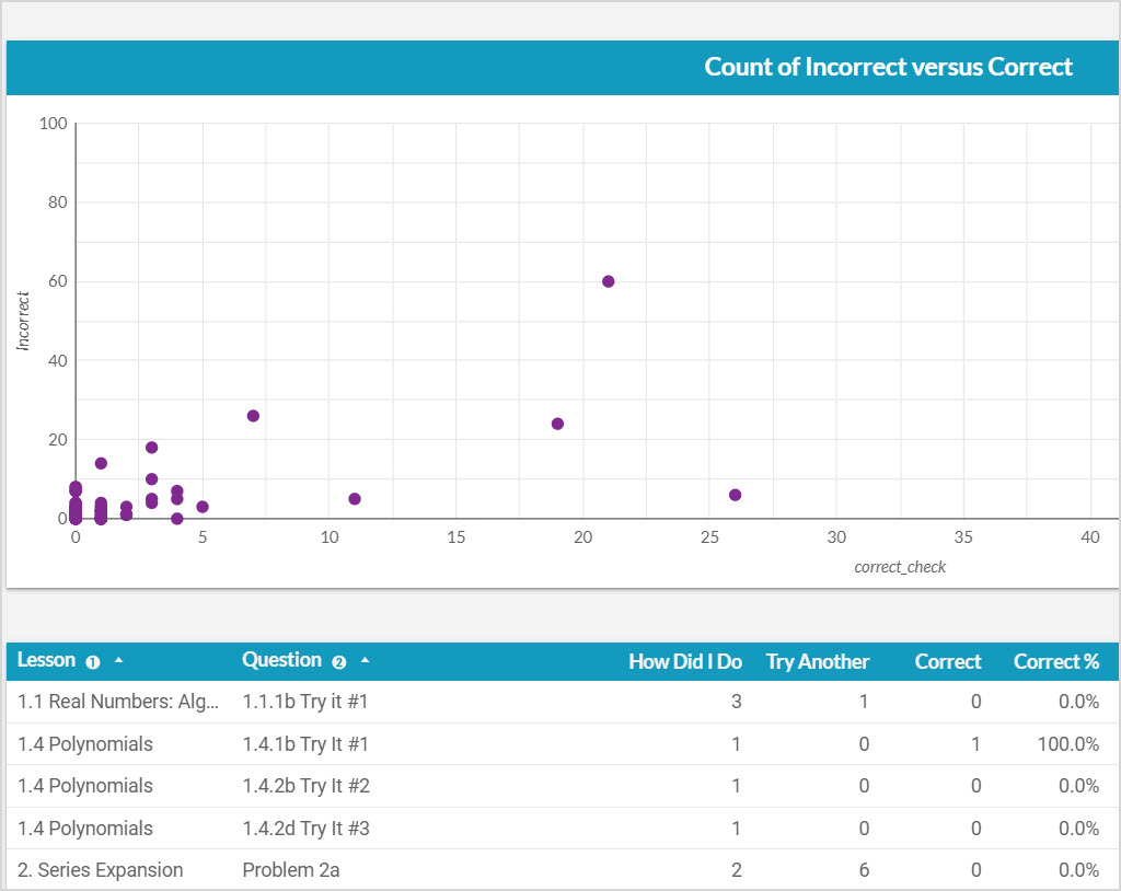
The Count of Incorrect versus Correct graph shows each question with the number of incorrect answers plotted against the number of correct answers, giving a snapshot of how users performed on each question.
The summary table gives an overall picture of user performance on a question-by-question basis. It shows how often the question was re-randomized by users (Try Another), how often a user checked their answer on the question (How Did I Do), and the average time each of those checks took (Avg. Time Per Attempt). It also shows how often the user's checked answer was correct, partially correct or incorrect.
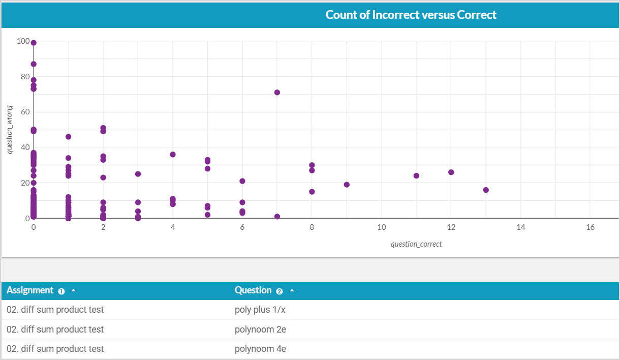
View the Questions (Assignments) dashboard
After accessing the Möbius Analytics dashboards, click Questions (Assignments) in the sidebar to view the sixth dashboard:
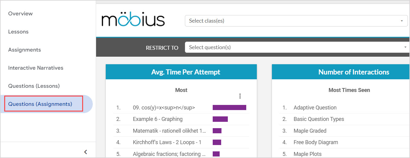
You can use the Restrict to Select question(s) drop-down to select specific questions and assignments just for the data on this dashboard:
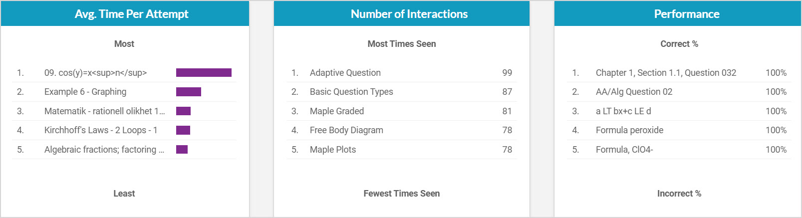
The Avg. Time Per Attempt panel shows the questions that users, on average, spent the most and least time attempting as part of assignments.
The Number of Interactions panel shows the questions with the most and least number of total views in assignments.
The Performance panel shows the questions with the highest and lowest percentage of correct answers as part of assignments.
The Count of Incorrect versus Correct graph shows each question with the number of incorrect answers plotted against the number of correct answers, giving a snapshot of how users performed on each question.
The summary table gives an overall picture of user performance on a question-by-question basis. It shows how often the user's answer was marked correct, and the average time spent on the question per assignment attempt.